Case Study Summary
Garth approached me in need of a logo for his landscaping business. A visual identity package was created for Bredy Landscaping that included logos, fonts, colours, hats, uniforms and vehicle decals. The project was a success and the client is happy with what he had received.
SCOPE OF WORK
The scope of work ended up being the following:
- Exported Logos
- Visual Identity Guidelines
01 DISCOVERY
Client Interview
We sat down at a local cafe to have a conversation about what he was looking in a logo.
Some example questions that I would ask would be:
- What are you using the logos for this project?
- What are some words that best describe the logo that you’re looking for?
- What type of clients are you trying to attract for your business?
- What are some services that you provide for your customers?
It is important to find a balance between business needs, customer perception and client preferences for an identity to empower the business.
Exploring through Pinterest
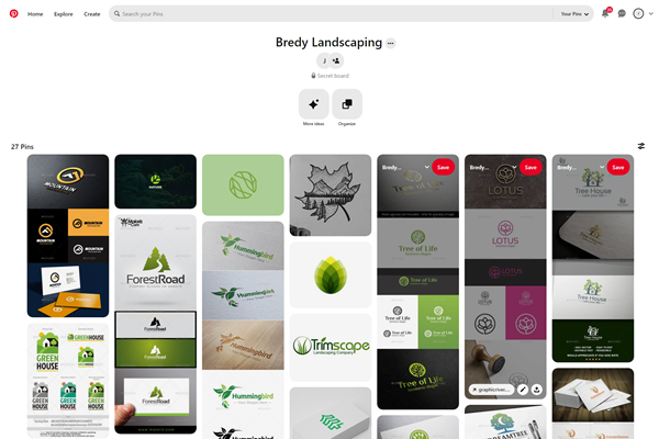
Pinterest is a great platform to see lots of logos in one space. I typed in a couple keywords that we had talked about during the interview and use them to return a list of visuals to browse through.
I created a board to save the logos that visually resonated with Garth so I can use that as a reference later on when I design their conceptual logos.
As we went through each one, I also asked questions to understand why they liked it so I can note it down. These words will also help inform the logo creation process later on.
I really enjoyed using this method as it involved the client to be collaborative with the work and adds a sense of ownership when we co-design.
02 EXECUTION
Concept Logos

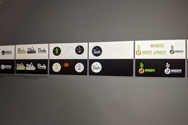
Using the pinterest board as reference, I categorized the reference logos into logo styles. From there, I used the notes that I took and created a variety of logo styles in my sketch book before translating into illustrator.
I also like to visualize the logos in both light and dark applications to ensure that there’s enough contrast in different contextual applications.

Meeting with the Client
I picked the top 5 designs that I felt best resonated with Garth from our previous conversations and allowed them to pick the one that resonated with them the best. He selected the one that is currently in use and he felt that it needed no additional refinement.
03 DELIVERY
After the logo was approved by Garth, I finalized logo by outlining the text so that it wouldn’t have missing font issues in future print scenarios. I also created a simple visual guideline, which included colours HEX codes, fonts used and what not to do with the logo.
Exported all logo variations:
- colour
- reverse colour
- true white
- true black
- greyscale
- reverse greyscale
- icon only
Also exported in the following file formats:
- JPG
- PNG
- SVG
- EPS
so it can be readily available to use for any application. WebP at this point was not supported by all browsers.
The client was satisfied with the result and requested website work afterwards.